
There were three main forces that pushed me to write this story: inspiration from the Uncovered + International Journalism Forum in Athens, experimenting with ChatGPT-5’s ability to support data-driven visual storytelling, and a desire to create an interactive narrative. In this article, I’ll walk you through how I gathered data, processed it, visualized it, and merged everything together to tell a story in a visual, interactive way.
Go directly to visualization below (does not work properly on mobile)
or connection graph
I’ve done visualizations in past investigations but with help from ChatGPT, things move to a different level.


TL;DR
I collected data on Polish members of parliament, enriched that dataset with the companies they are connected to (as director, secretary, etc.), filtered to focus on limited liability companies, and turned it into a visual story. The graphs are broken down by category, timeline, geography, and flows between people and theirs companies activity code.
You can lookup dataset and build your own visualizations from my Github repo.

Idea
At the International Journalism Forum conference, I met fantastic people and attended sessions including tracking natural disasters with free satellite images providers, or masterclass in investigative journalism. It opened my interest in visual storytelling and I had to test ChatGPT5 capabilities anyway, for my upcoming workshop, so it was a perfect occasion.
Btw, check winners in the Impact award 2025

Every data-driven investigation starts with data, more quality data means more possibilities for insight and visualization. I like exploring corporate structures, business entities, and how influential individuals invest their money. Politicians and government officials are especially simple to track, as they operate many businesses and are public figures and their profiles are easier to validate. In a longer investigation, you could expand into their voting records, public declarations, or real estate holdings. But for now, let’s focus on building the core dataset.
Steps 1 - Data collection
First, find the list of people you want to study. For me, that was Polish deputies. The Sejm’s official site publishes their names in alphabetical or party order, along with metadata like date of birth.
It gives us 460 records, which includes name, surname, party or date of birth (important). Below script can extract data from the single entity, which can be taken from the list of deputies.
import requests
from lxml import html

url = "https://www.sejm.gov.pl/sejm8.nsf/posel.xsp?id=003&type=P"
response = requests.get(url)
response.encoding = "utf-8"

tree = html.fromstring(response.text)

data = {}

name = tree.xpath('//h1/text()')
if name:
    data["name"] = name[0].strip()

# Extract paragraph texts
paragraphs = tree.xpath('//p/text()')

for p in paragraphs:
    p = p.strip()
    if p.startswith("Data i miejsce urodzenia:"):
        data["dob"] = p.replace("Data i miejsce urodzenia:", "").strip()
    elif p.startswith("Klub/koło:"):
        data["party"] = p.replace("Klub/koło:", "").strip()

for key, value in data.items():
    print(f"{key}: {value}")
Once you’ve scraped and saved that as a JSON list, you have the first piece: person + metadata.
Making connections
Next, you take your list of people and search for companies connected to them (as founder, director, secretary, liquidator, etc.). This is the “people → companies” step.
There is no universal government portal that accepts a person’s name + date of birth and returns all their company affiliations. Instead, you often must search by company registration numbers or use third-party services. In Poland, for example, Rejestr.io is one such service.
By paying for API access and using credits, you can query the person (by name and DOB), get their internal ID in that system, and then request all their past and present company associations. Your first enriched record might look like:
{
    "name": "Zbigniew Ajchler",
    "party": "Platforma Obywatelska",
    "district": "38  Piła",
    "votes": "7275",
    "birth_date": "21-11-1955",
    "birth_place": "Szamotuły",
    "education": "wyższe",
    "school": "Akademia Rolnicza w Poznaniu, Wydział Rolniczy, Mechanizacja rolnictwa - magister inżynier (1981)",
    "profession": "agroprzedsiębiorca",
    "current_relations_count": 7,
    "historical_relations_count": 4,
    "krs_id": "988983",
    "ipn_id": "150953",
    "rejestr_id": "598574"
  }
where rejestr_id, krs_id, ipn_id, are IDs related to rejestr.io database.
Once you have these values, you can query another endpoint to get a list of connected companies.
https://rejestr.io/api/info/dane-osoby
The endpoint for historical and current are counted separately and each request is another credit, but we can collect enormous data of information of the company and the example is below
      {
        "adres": {
          "kod": "62-045",
          "miejscowosc": "Lubosina",
          "nr_domu": "11",
          "panstwo": "Polska",
          "poczta": "Pniewy",
          "teryt": {
            "gmina": "302406",
            "powiat": "3024",
            "wojewodztwo": "30"
          },
          "ulica": ""
        },
        "glowna_osoba": {
          "id": "598574",
          "imiona_i_nazwisko": "Zbigniew Ajchler"
        },
        "id": 189639,
        "krs_powiazania_kwerendowane": [
          {
            "data_koniec": null,
            "data_start": "2004-01-29",
            "kierunek": "PASYWNY",
            "opis": "PREZES ZARZĄDU",
            "typ": "KRS_BOARD"
          }
        ],
        "krs_powiazania_liczby": {
          "aktualne": 4,
          "przeszle": 4
        },
        "krs_rejestry": {
          "rejestr_przedsiebiorcow_data_wpisu": "2004-01-29"
        },
        "krs_wpisy": {
          "najnowszy_data": "2025-06-10",
          "najnowszy_numer": 35,
          "pierwszy_data": "2004-01-29"
        },
        "metadane": {
          "krs_odpis_synchronizacja_data_czas": "2025-08-22 07:35:25"
        },
        "nazwy": {
          "pelna": "ROLNICZA SPÓŁDZIELNIA PRODUKCYJNA W LUBOSINIE",
          "skrocona": "ROLNICZA SPÓŁDZIELNIA PRODUKCYJNA W LUBOSINIE"
        },
        "numery": {
          "duns": "522413251",
          "krs": "0000189639",
          "nip": "7871030025",
          "regon": "630426381"
        },
        "stan": {
          "czy_dofinansowana_przez_ue": false,
          "czy_jest_na_gpw": false,
          "czy_otrzymala_pomoc_publiczna": true,
          "czy_pozytku_publicznego": false,
          "czy_spolka_skarbu_panstwa": false,
          "czy_wykreslona": false,
          "forma_prawna": "SPÓŁDZIELNIA",
          "pkd_przewazajace_dzial": "Uprawy rolne, chów i hodowla zwierząt, łowiectwo, włączając działalność usługową",
          "w_likwidacji": false,
          "w_upadlosci": false,
          "w_zawieszeniu": false,
          "wielkosc": "mala"
        },
        "typ": "organizacja",
      }
This record shows where a person appears in company filings, what role he held, when it started, and whether the organization received public funding. These fields are extremely useful for both filtering and analysis later on.
Finding PKD
Polish companies use PKD codes (Polska Klasyfikacja Działalności) to categorize their main activity of business. However, this information is sometimes incomplete or missing in third-party datasets.
To fix that, you can call the official KRS API again for each company, pulling the “primary business activity” (przedmiotPrzewazajacejDzialalnosci). This step ensures proper classification which is important for later grouping by sectors like real estate, media, or finance.
https://api-krs.ms.gov.pl/api/krs/odpispelny/0000634863?rejestr=S
Adding geocode
Once the business dataset is complete, it’s worth geocoding company addresses to enable geospatial analysis. Turning textual addresses into latitude and longitude allows you to map connections geographically for example, showing clusters of companies tied to one party or region.
A simple script using the Google Maps Geocoding API might look like this:
out = []
for i, place in enumerate(places, 1):
    q = place["query"]
    url = f"https://maps.googleapis.com/maps/api/geocode/json?address={q}&key={API_KEY}"
    r = requests.get(url)
    data = r.json()

    if data.get("results"):
        loc = data["results"][0]["geometry"]["location"]
        place["lat"] = loc["lat"]
        place["lon"] = loc["lng"]
    else:
        place["lat"], place["lon"] = None, None

    out.append(place)
    print(f"{i}/{len(places)} → {q} → {place['lat']}, {place['lon']}")
At this point, the dataset contains both people and organizations, the two most important parts of our investigative graph. Each record describes who’s connected to what, when the link began or ended, what role the person had, and what type of organization it was.
In other words, we now have all the ingredients for an interactive network: nodes (people and companies) and links (relationships between them). In addition, extra information like PKD code, timestamps or coordinates allow to experiment with more graphs.
The next step is transforming and visualizing these relationships i.e. turning raw data into something that readers can explore in an interactive way.
Step 2 - Transformation
Once the dataset was complete, it was time to reshape it into a format suitable for visualization. Raw data from registries, APIs, and scrapers rarely fits into any visualization library. You need to clean it, standardize field names, and merge different sources into a consistent structure.
This phase is often the most technically challenging and time-consuming. It requires not just algorithmic thinking but also a clear understanding of what the visual output should look like. For instance, a network graph needs one kind of schema, while a timeline chart or map needs another.
That’s where ChatGPT can help a lot and can act as a data parser, helping you transform raw records into the structure you need for visualization tools like D3.js.
It can also reason about the schema and automatically build the correct hierarchy of objects (nodes, links, attributes, etc.) with proper field naming, data types, and deduplicated IDs.
Network graph
If you read my previous posts, you should be already acquainted with the format d3js takes to draw variety of graphs, and the simplest one is network graph.
Each person and company must be converted to nodes, and, in links section, source and target must be specified. Doing it manually, we would have to iterate over all items, check if the person is associated with historical or current company, grab additional information about it, make a connections links and filtering only unique values.
{
  "nodes": [
    {
      "id": "STOWARZYSZENIE NA RZECZ NOWEJ KONSTYTUCJI KUKIZ'15",
      "type": "organization",
      "org_id": 599414,
      "miasto": "Wrocław",
      "krs": "0000599414",
      "nip": "8982216779",
      "regon": "363649475",
      "pkd_przewazajace_dzial": null,
      "czy_dofinansowana_przez_ue": false,
      "czy_otrzymala_pomoc_publiczna": false,
      "czy_spolka_skarbu_panstwa": false
    },
    {
      "id": "Piotr Apel",
      "type": "person",
      "name": "Piotr Apel",
      "party": "Kukiz'15",
      "district": "9  Łódź",
      "profession": "dziennikarz",
      "birth_date": "08-02-1984",
      "birth_place": "Warszawa",
      "rejestr_id": "401323"
    }
  ]
}
"links": [
{
"source": "STOWARZYSZENIE KOCHAM PODLASKIE",
"target": "glowna_osoba:1198245",
"relation": "glowna_osoba"
},
{
"source": "Marek Jakubiak",
"target": "STOWARZYSZENIE NA RZECZ NOWEJ KONSTYTUCJI KUKIZ'15",
"relation": "historical"
}
]
}It would be a complex task, but luckily knowing the output format and exact thing we want to accomplish, simple prompt will be sufficient.
You are a data analyst.
Your task is to parse and transform a large dataset into a format compatible with D3.js network graphs.

- Create two arrays: "nodes" and "links".

- Each node should include:
  - id, name, type (person or organization),
  - krs, address, and id fields where available.

- Each link should include:
  - source (person name or ID),
  - target (company name or ID),
  - relation_type (e.g. PREZES, UDZIAŁOWIEC),

- Remove duplicates and empty fields.
- Return valid, clean JSON ready for D3.js rendering.
After that, it returns parsed json data in the proper format suitable for d3js.
You can ask it to make a graph and customize it. You don't need to have full idea instantly, but rather be inspired by adding "NY Times, ICIJ like investigative storytelling style" to your prompt.
Prepare an interactive D3.js network graph using the attached dataset.
Requirements:

- Each person and organization/company is a node.
- Make it minimalist in style of investigative story from NYTimes or ICIJ.
- Use different icons for people and companies (e.g., circle vs. square).
- Add a legend in the top-left corner describing node and edge types.
- Include a toggle switch to show or hide current connections (status = "current").
  - When the toggle is off, hide all current connections.
- On clicking a node or edge, show a popup window with all available metadata (name, party, role, PKD, address, etc.).
- Highlight all directly connected nodes and links to the selected item.
- Return clean, production-ready JavaScript code and D3.js logic to load the dataset dynamically.
After firing up HTTP server on localhost server and accessing the main html file you will have similar output as the graph below, depending on dataset and customized options.
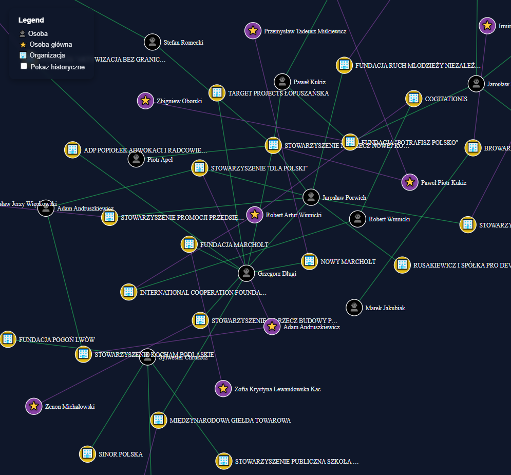
This visualization shows just a small fragment of a much larger network graph.
Even in this snippet, the connections are clear and you can quickly see which clusters attract the most people and how they are grouped by person.
Explore whole graph below
A network graph is an excellent tool for exploring who cooperates with whom and which companies are involved in those circles.
Still, uncovering the more meaningful connections takes time, patience, and research. That’s a separate stage of the investigation, but it’s also something ChatGPT can assist with, by helping to analyse patterns or check who is involved in which organizations.
Unless you identify a specific cluster of unusual activity, a large network by itself doesn’t tell a story.
This example is one of the simplest network views you can create. There are many more transformations and visual approaches to be tried.
You can ask ChatGPT for new graph concepts or focus on developing your own story based on what the data reveals.
Step 3 - Visualizations
Numbers alone are difficult to remember, and most people are visual learners. Graphs, on the other hand, deliver information instantly, especially when they’re part of a story rather than a static chart.
The core story here is simple: which deputies are connected to which companies, and what kind of activities those companies are involved in.
After visualizing connections, I wanted to quantify them. Which business sectors appear most often among companies connected to politicians and theirs party.
That’s where PKD codes come in handy. Each company’s activity type like real estate, construction, agriculture, or consulting can be grouped and visualized as bars.
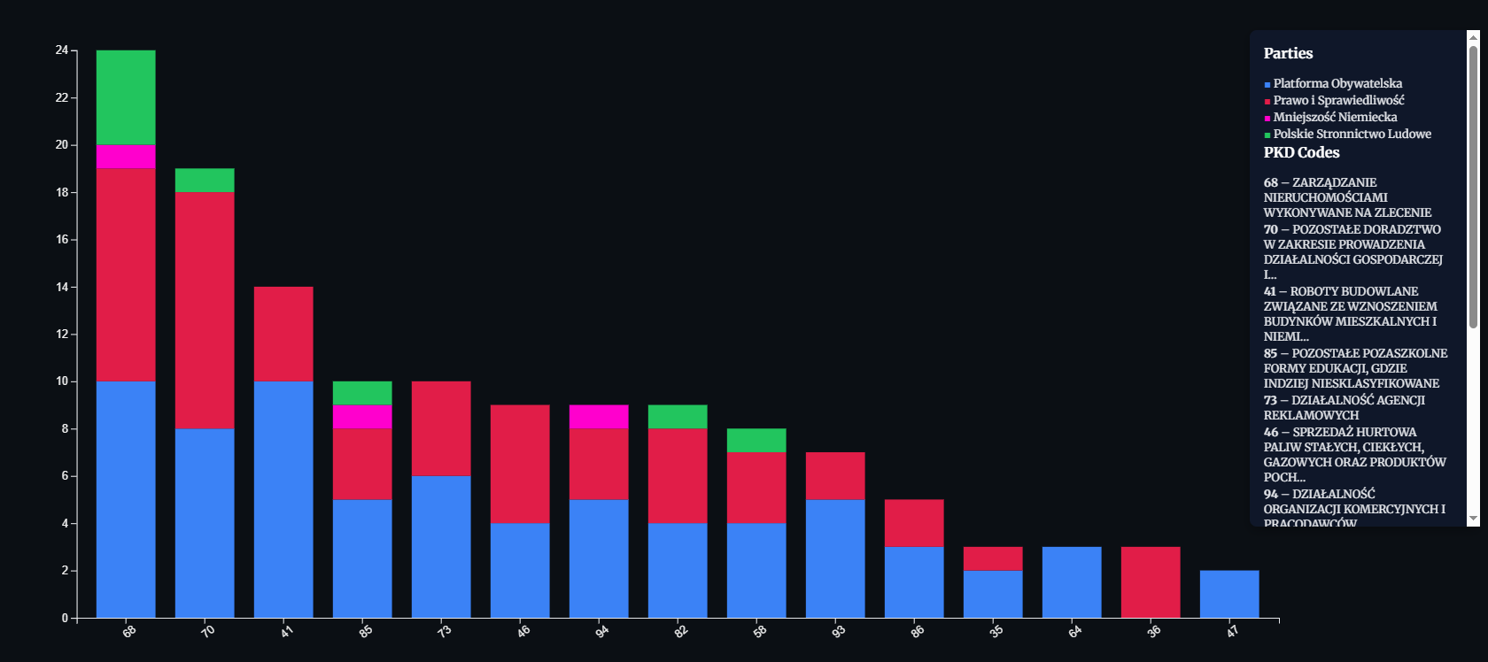
The main ones are 68 and 41 and related to real estate, what the next graph refers to.
The timeline visualization adds another dimension, when a person was associated with a company.
Each relationship contains start and end dates:
{
  "krs_powiazania_kwerendowane": [
          {
            "data_koniec": "2018-10-30",
            "data_start": "2016-09-13",
            "kierunek": "PASYWNY",
            "opis": "PREZES",
            "typ": "KRS_BOARD"
          }
      ]
  }
By plotting these as horizontal bars, we can see how long someone served in a company role.
The chart can become even more informative if we add vertical separators for election years or major political changes.
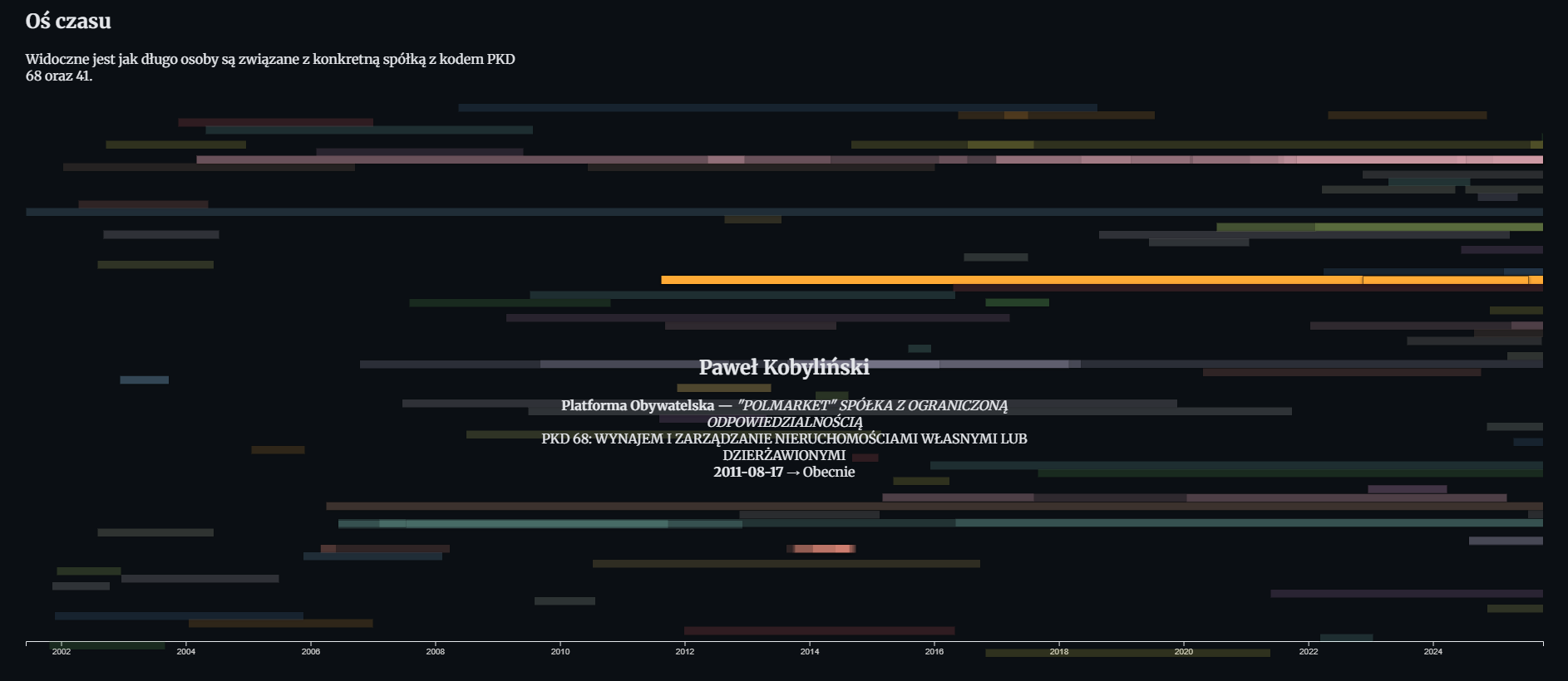
When the reader hovers over a bar, additional details appears for instance, the company name, position, or PKD category.
Such micro interactions help make complex datasets feel alive.
Step 4 - Storytelling
All these visualizations come together in one key principle: storytelling.
Charts alone aren’t the story, they are tools that help guide the audience through your investigation.
In my case, the investigation wasn’t focused on exposing wrongdoing but rather on building a proof of concept and a working model for interactive investigative storytelling.
This story served as a warm-up by testing the technical workflow and ChatGPT’s ability to support it.
In a full-scale investigation, you’d start identifying anomalies like unusual overlaps between political and business interests, recurring directors, or companies with suspicious funding patterns. Once detected, those points can become the narrative core.
I intentionally kept the presentation minimalist: clear visuals, short commentary, and deliberate pacing. Each visualization appears gradually allowing the reader to absorb insights before moving to the next part. Animations, smooth transitions, and fade effects make the experience more cinematic without distracting from the evidence.
Working with ChatGPT was both helpful and unpredictable. It’s powerful at transforming and combining data but requires extremely concrete instructions. Sometimes, it changed code formatting or deleted parts of CSS for some reason.
To manage this, I created separate “branches” of our conversation to experiment with new visual ideas without losing stable versions of previous work.
While building this piece, I revisited several strong examples of interactive investigative journalism that successfully combine data, storytelling, and design.
https://www.reuters.com/investigates/special-report/usa-fentanyl-supply-chain-shipping/

Step 5
The dataset I built is broad but not yet deep. The next goal is to look for mismatches, conflicts of interest, and hidden links, these elements that transform a data project into an investigative story.
Every dataset can become a story if you take the time to connect the dots and build an experience around it. The next stage of the work will focus on depth rather than size and try to trace financial flows, ownership changes, or recurring company directors across multiple parties and years.
There are several directions to continue from here:
- Find the outstanding points.
Once all data is visualized, anomalies begin to stand out. People who appear in unexpected sectors, or companies tied to several political circles. These are often the starting points for real investigative leads. - Enrich dataset with new sources.
Integrating property records, public procurement data, or EU fund allocations could reveal where influence translates into contracts or real assets. Even small overlaps between these datasets can expose interesting patterns. - Transform into solid storytelling.
Future visualizations should include narrative annotations like small summaries, quotes, or linked documents that explain why a connection matters.
If you’re interested in exploring these methods or adapting them for your own research, stay tuned for the next article and follow me on Twitter.